SNOK
Brand Identity
Strategy and Design
Brand Identity
Strategy and Design
Industry
Hospitality, Consumer Goods, Lifestyle
Hospitality, Consumer Goods, Lifestyle
Project Scope
BI Strategy, Brand Naming, Brand Identity Design,
Package Design, Application Design
BI Strategy, Brand Naming, Brand Identity Design,
Package Design, Application Design
SNOK은 컴퍼니합이 전개하는 어메니티 전문 브랜드로서 ‘물’을 중심으로 호텔 및 다양한 브랜드 IP와 제휴하여 유통 및 협업형 비즈니스를 전개하고 있으며 독립된 브랜드로서 프리미엄한 경험을 제공하고 있습니다.
케이스 크리에이티브는 브랜드 네이밍부터 비주얼 아이덴티티 개발 전반을 담당했습니다.
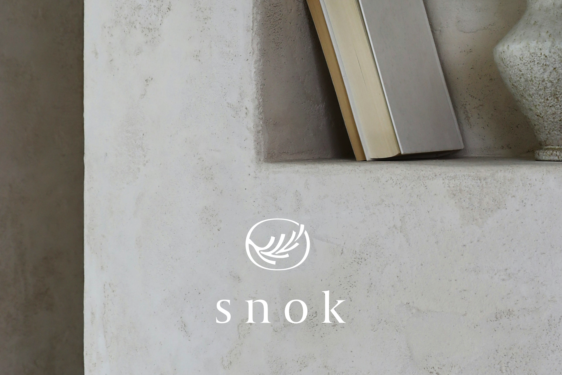
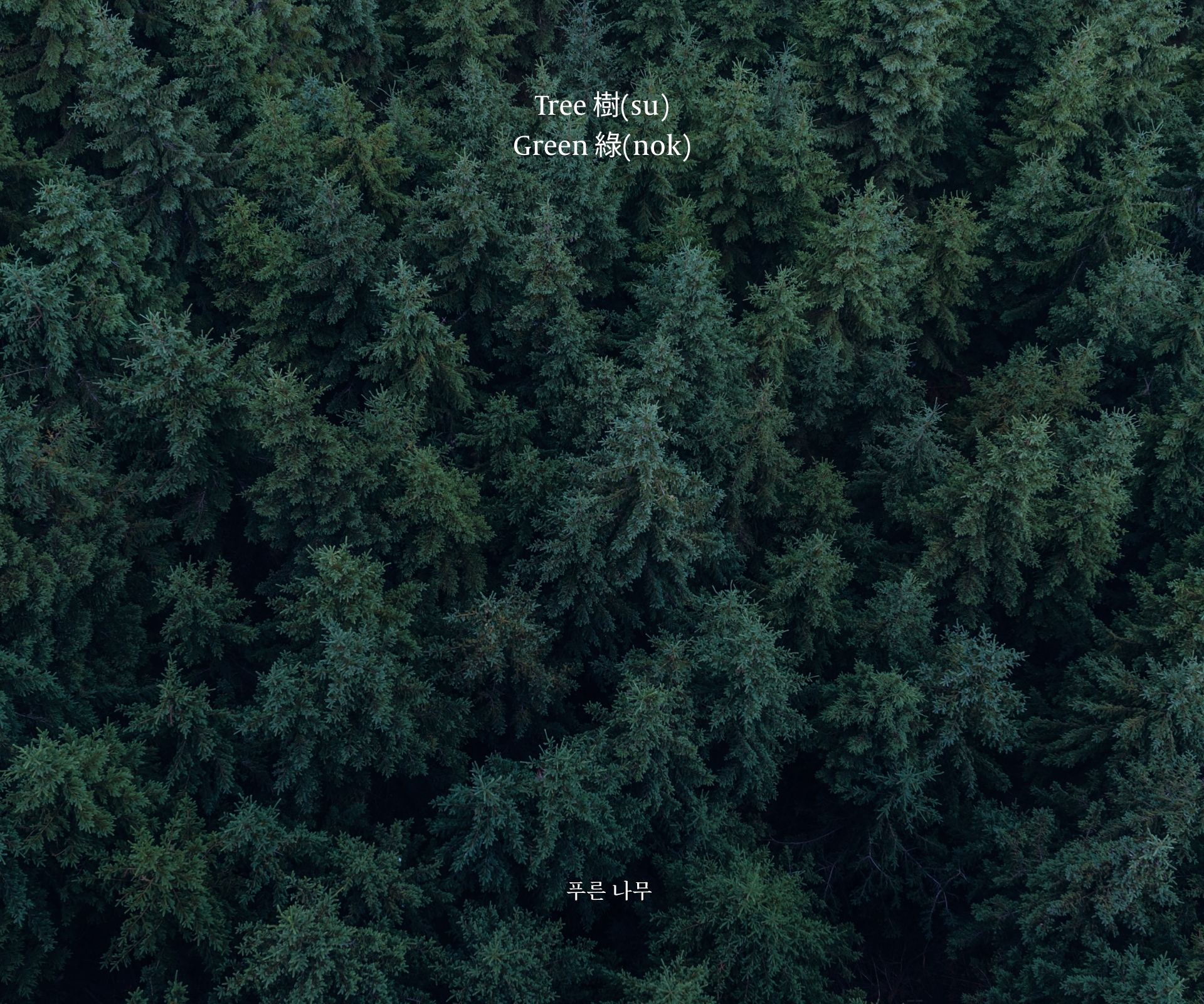
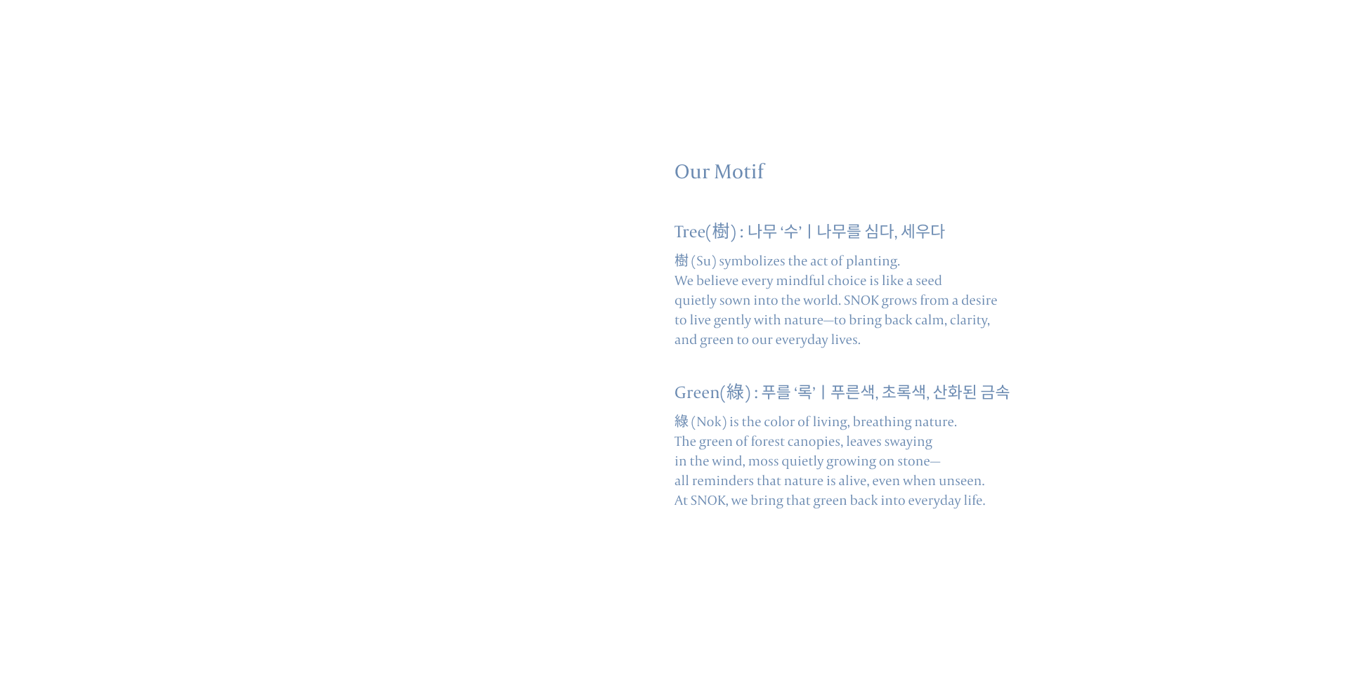
‘SNOK’이라는 브랜드명은 한자 ‘수록(樹綠, 나무 수 / 푸를 록)‘에서 착안하여, 브랜드 키워드인 ‘미감쾌청(美感快晴)‘을 중심에 두고 엠비언트(ambient)한 정서를 시각화하는 데 중점을 두었습니다. 이는 어메니티라는 제품 특성상 환경, 감성, 분위기를 전달해야 하는 브랜드의 본질을 반영한 것이며, 전체적인 디자인 방향은 이 감각적 정서를 시각화하는 데 집중했습니다.
케이스 크리에이티브는 브랜드 네이밍부터 비주얼 아이덴티티 개발 전반을 담당했습니다.
‘SNOK’이라는 브랜드명은 한자 ‘수록(樹綠, 나무 수 / 푸를 록)‘에서 착안하여, 브랜드 키워드인 ‘미감쾌청(美感快晴)‘을 중심에 두고 엠비언트(ambient)한 정서를 시각화하는 데 중점을 두었습니다. 이는 어메니티라는 제품 특성상 환경, 감성, 분위기를 전달해야 하는 브랜드의 본질을 반영한 것이며, 전체적인 디자인 방향은 이 감각적 정서를 시각화하는 데 집중했습니다.
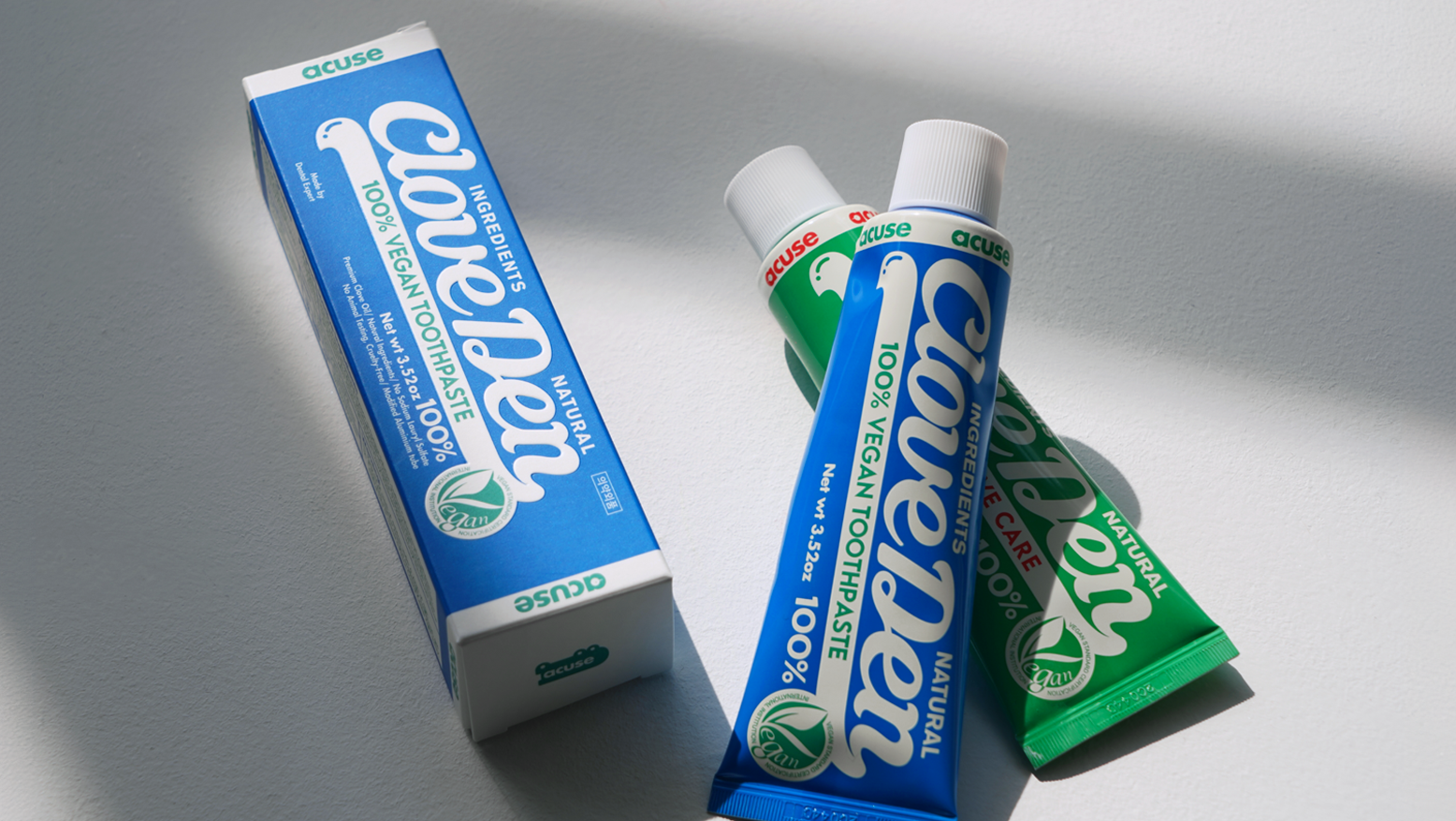
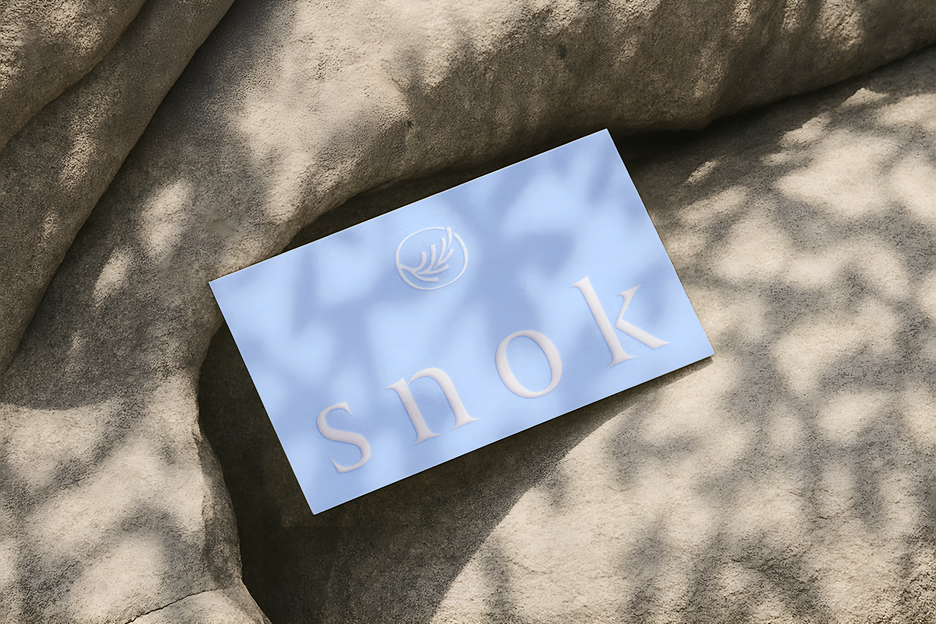
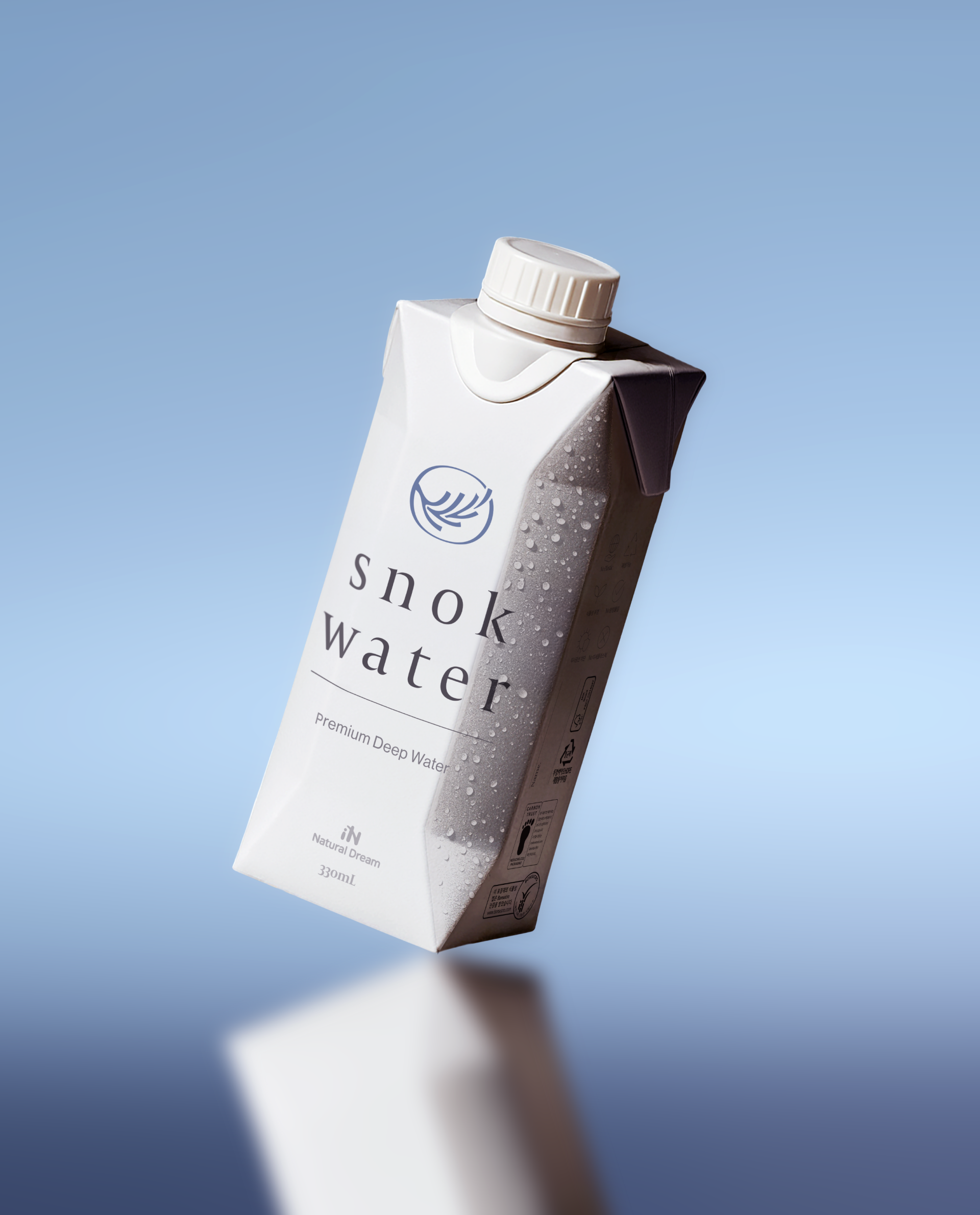
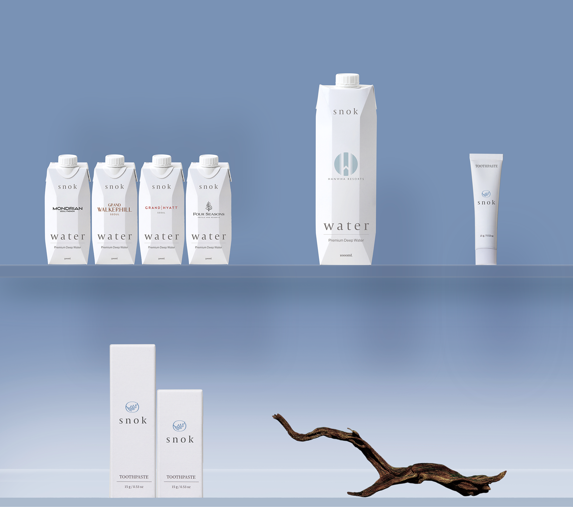
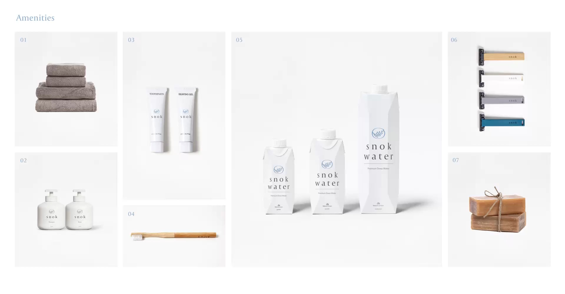
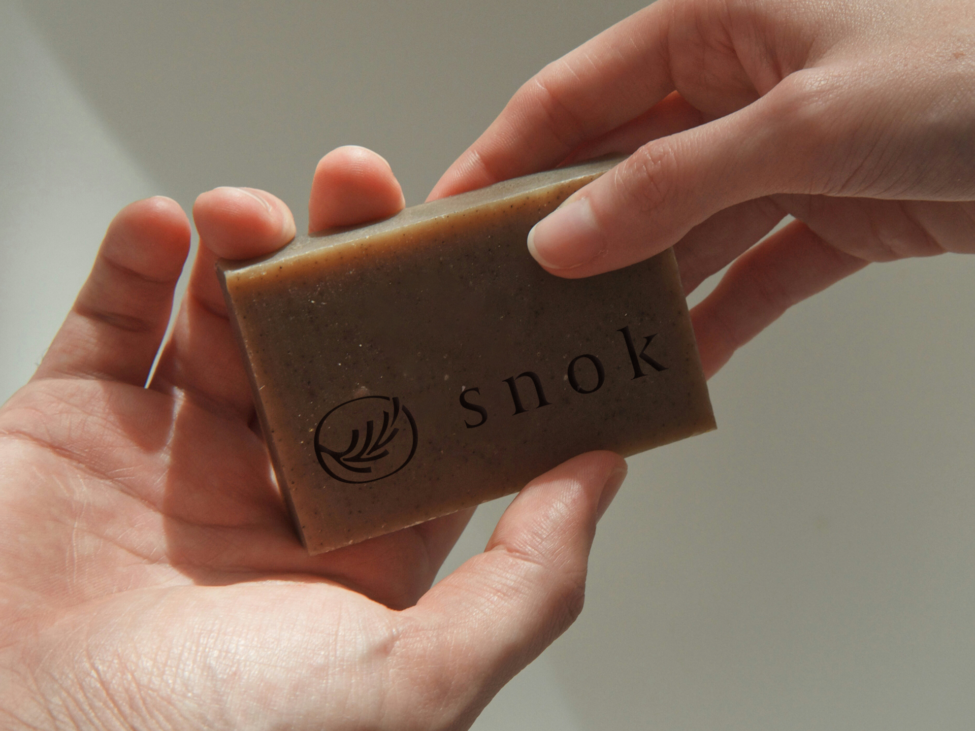
브랜드 컬러는 라이트 블루 계열로 설정하여 청량하고 절제된 인상을 부여했고, 심볼은 바람에 흔들리는 나뭇가지의 유기적 형태를 모티브로 개발했습니다. 심볼, 워드마크, 컬러 전반에 걸쳐 ‘눈에 띄기보다 스며드는’ 엠비언트 컨셉을 바탕으로 과도한 개성을 덜어내고, 절제된 미감을 통해 브랜드 톤을 완성했습니다. 대표 제품인 SNOK Water는 다양한 제휴 브랜드 로고가 자연스럽게 노출될 수 있도록 유연한 패키지 시스템으로 설계되어, 브랜드 간 협업에 최적화된 플랫폼형 어메니티 브랜드로 기능합니다.
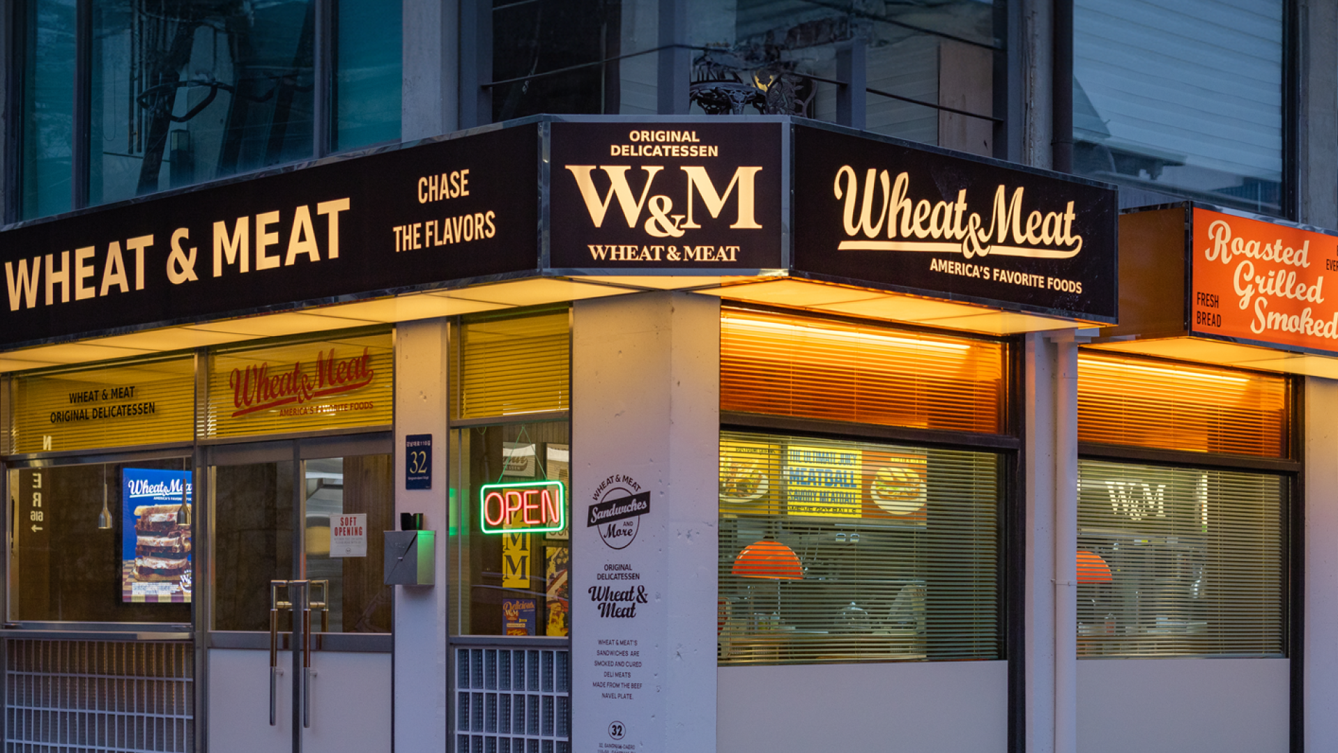
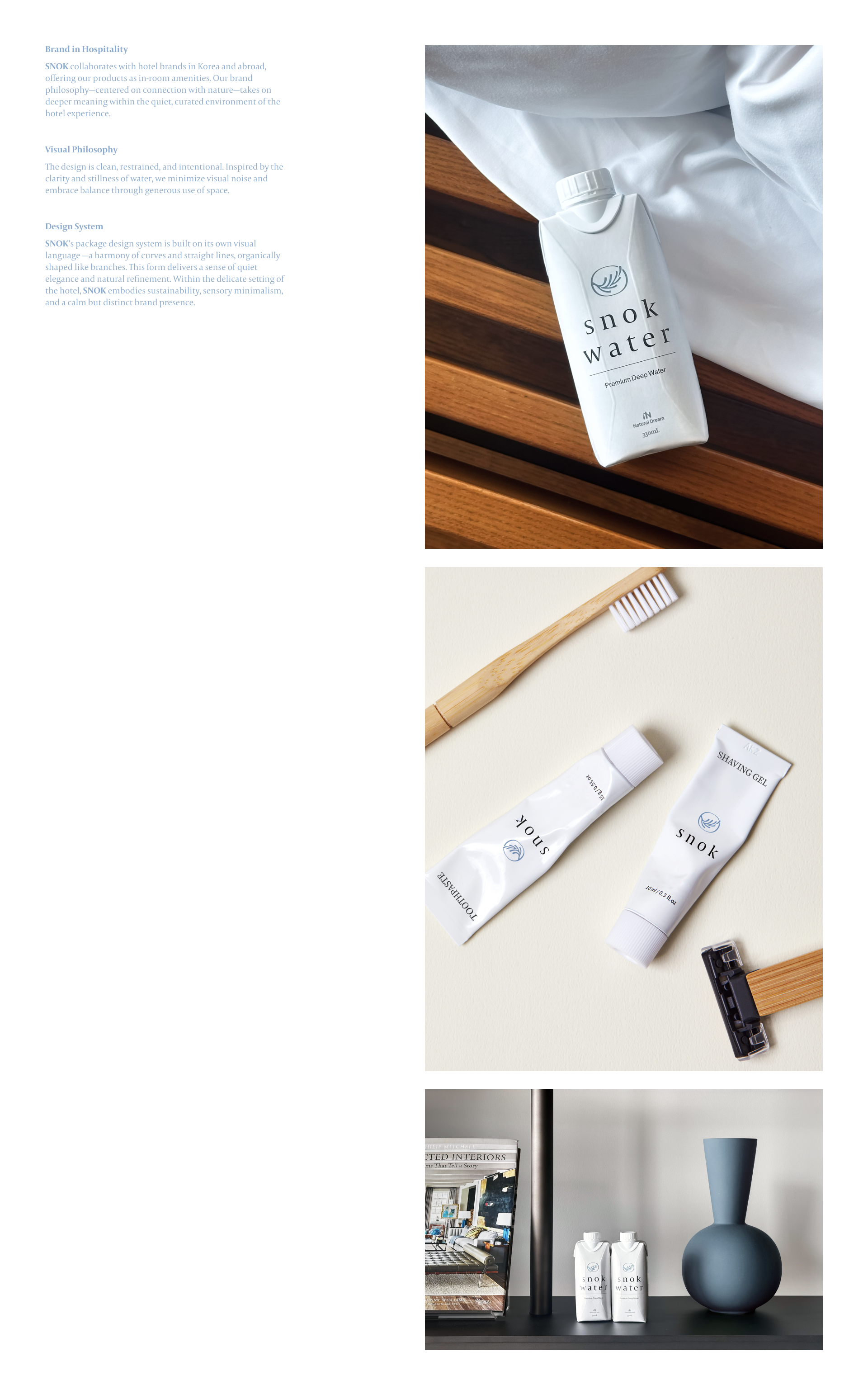
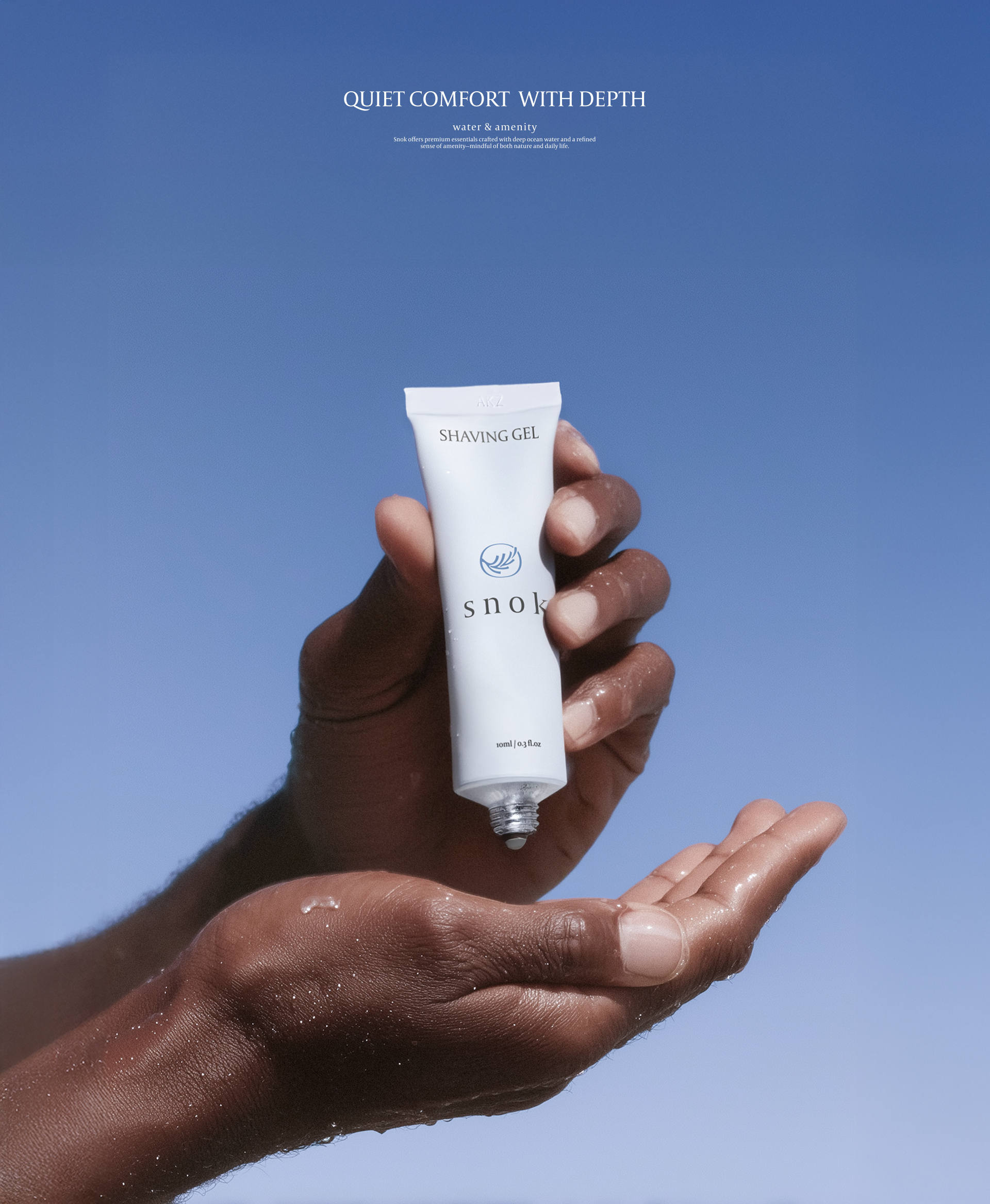
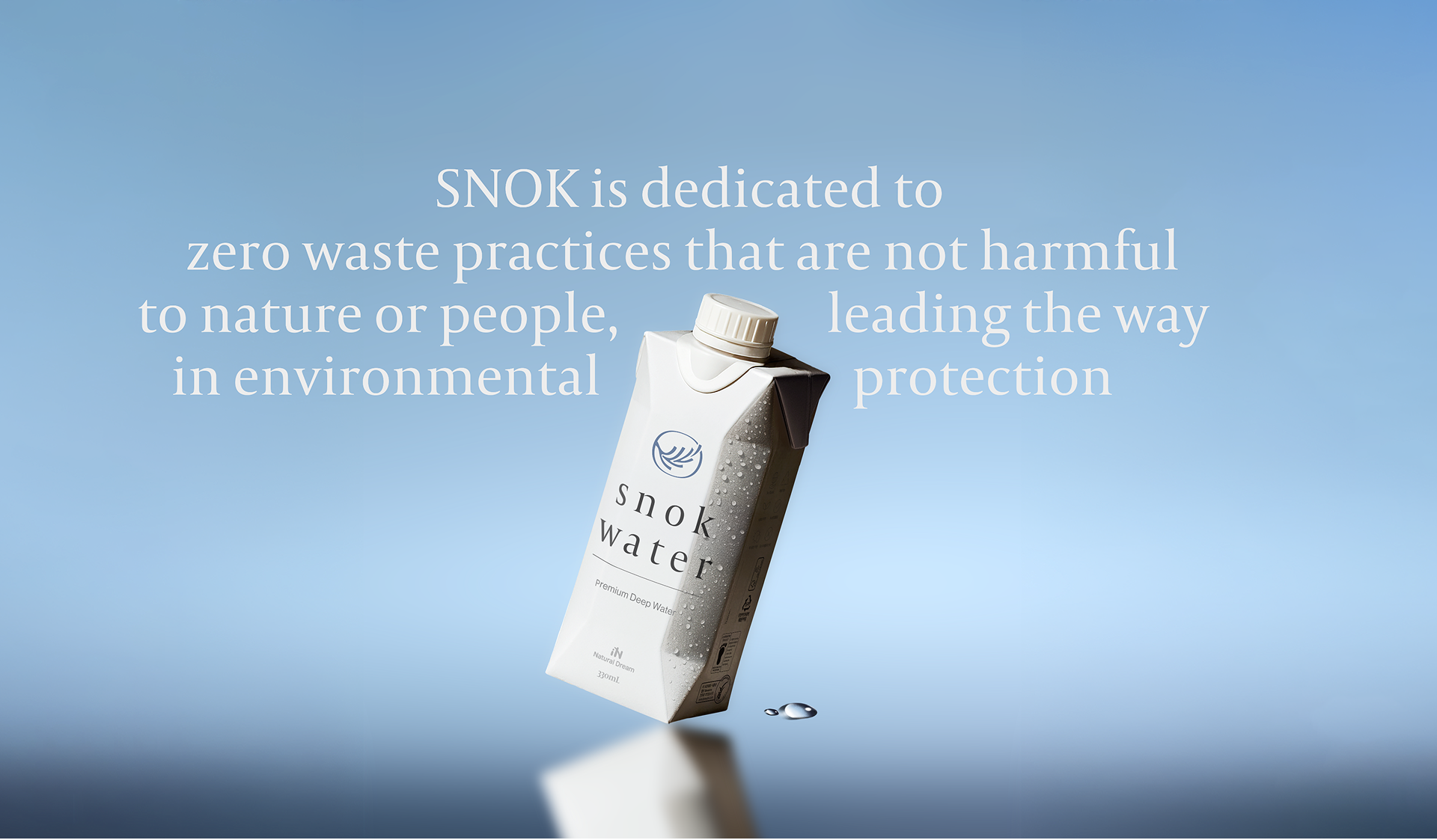
SNOK is an amenity brand developed by Company HAP, focusing on bottled water as its core product. The brand engages in collaborative and distribution-based partnerships with hotels and various IP brands. Rather than simply supplying amenities, SNOK aims to deliver a premium experience as an independent brand.
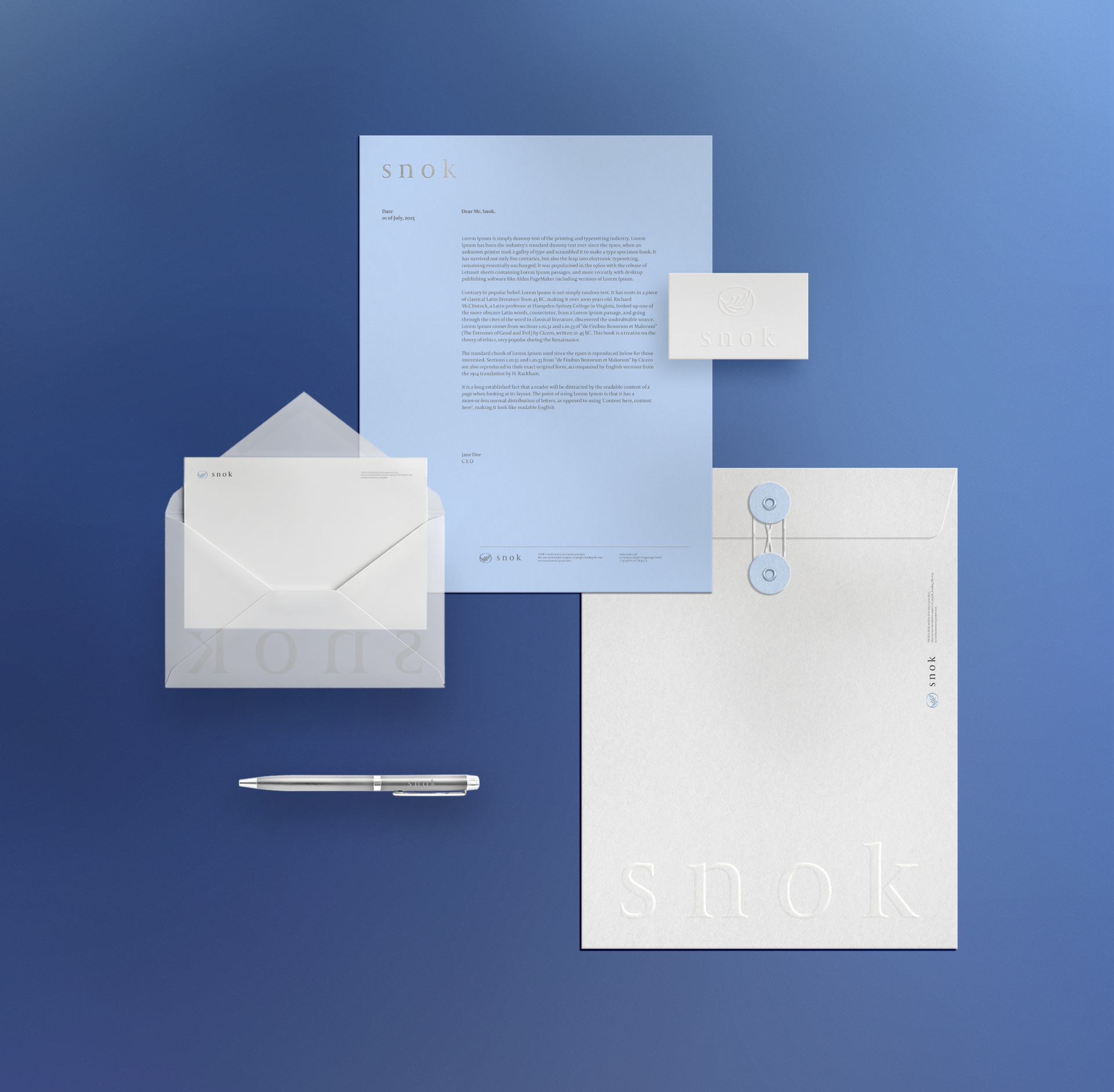
Case-creative led the project from brand naming to the full development of the visual identity.
The name “SNOK” is inspired by the Sino-Korean characters “樹綠” (tree and green), and reflects the brand keyword “Mi-Gam-Kwae-Cheong,” which conveys a sense of aesthetic clarity and refreshing beauty. This direction embodies the ambient qualities essential to amenity products—environment, emotion, and atmosphere—and served as the foundation for the brand’s overall visual concept.
The name “SNOK” is inspired by the Sino-Korean characters “樹綠” (tree and green), and reflects the brand keyword “Mi-Gam-Kwae-Cheong,” which conveys a sense of aesthetic clarity and refreshing beauty. This direction embodies the ambient qualities essential to amenity products—environment, emotion, and atmosphere—and served as the foundation for the brand’s overall visual concept.
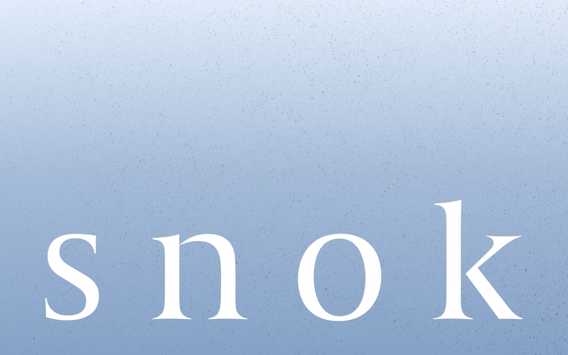
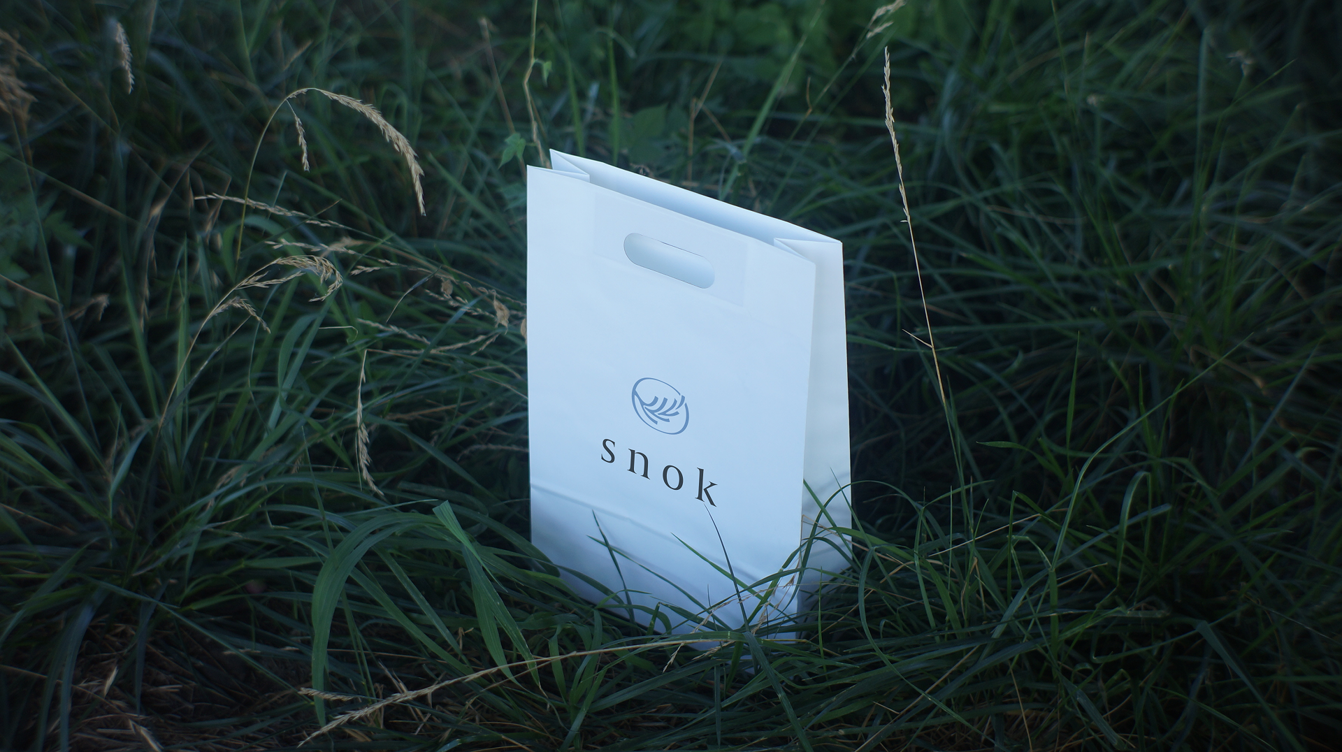
The brand color, a light blue palette, was chosen to express clarity and restraint, while the symbol—a branch gently swaying in the wind—was designed with organic form and subtle movement. From the symbol to the wordmark and color system, the visual identity was developed with an ambient approach, favoring subtlety over overt expression to achieve a calm and refined brand tone.
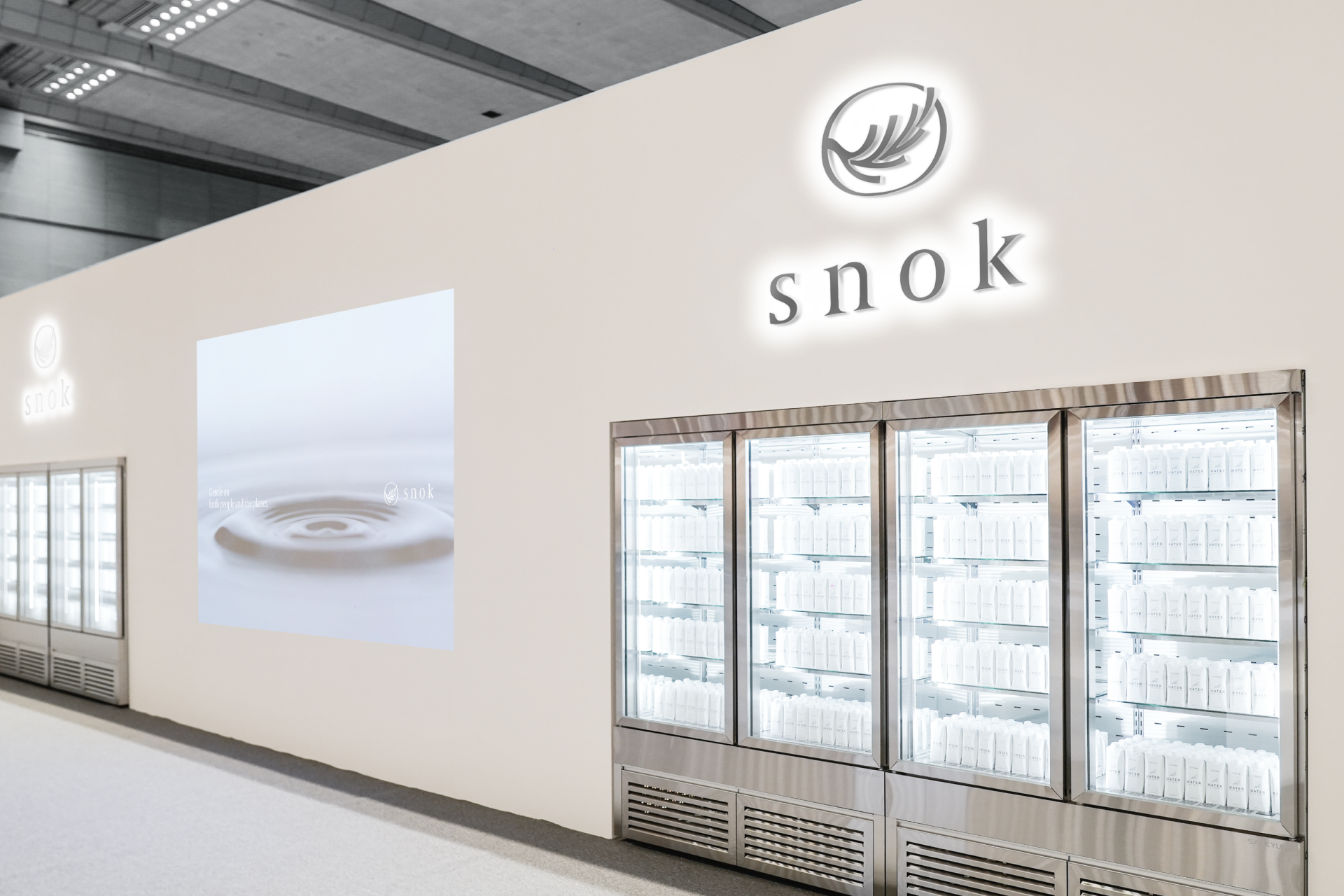
The flagship product, SNOK Water, features a flexible packaging system that allows partner logos to be naturally integrated, positioning the brand as a platform-oriented amenity solution optimized for co-branding.
The flagship product, SNOK Water, features a flexible packaging system that allows partner logos to be naturally integrated, positioning the brand as a platform-oriented amenity solution optimized for co-branding.
Snok BI Strategy and Design
Year: 2024
Client: Company HAP
Case-creative
Creative Direction: Joo wonsik, Jo inhyuk
Brand Strategy: Joo wonsik
BI System Design: Joo wonsik, Jo inhyuk, Lim eunji
Design Application: Lim eunji
Design Assistant: Lee jiyeong
Year: 2024
Client: Company HAP
Case-creative
Creative Direction: Joo wonsik, Jo inhyuk
Brand Strategy: Joo wonsik
BI System Design: Joo wonsik, Jo inhyuk, Lim eunji
Design Application: Lim eunji
Design Assistant: Lee jiyeong
Case-Creative Ⓒ All Rights Reserved