Charari Powder Meal
BI & Package Design
BI & Package Design
Industry
Health Food / Meal Replacement
Health Food / Meal Replacement
Project Scope
Brand Identity Design, Package Design
Brand Identity Design, Package Design
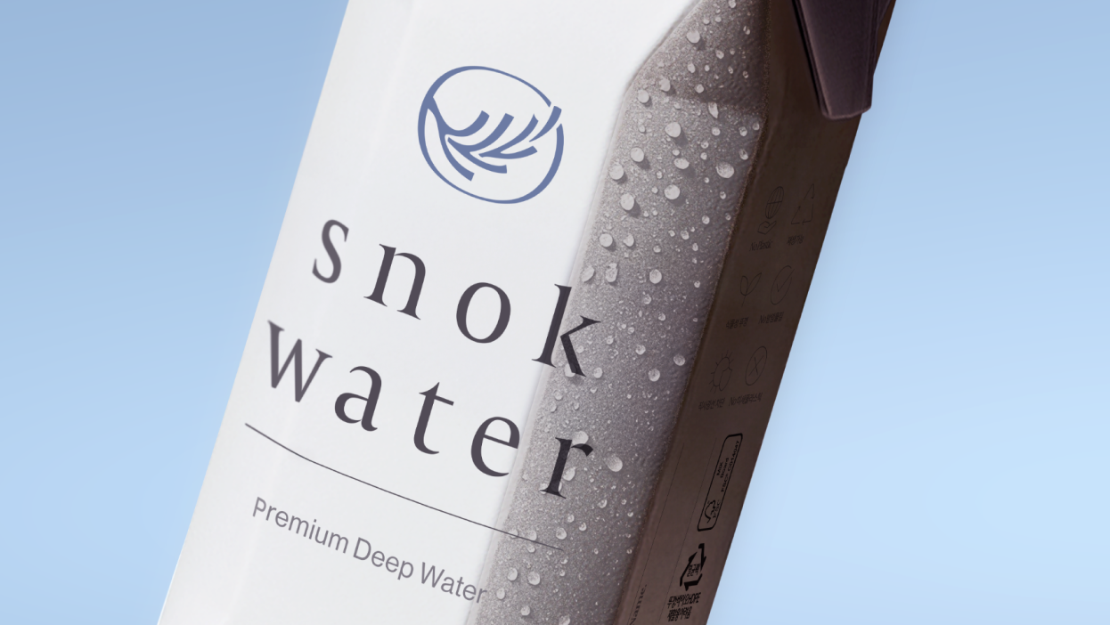
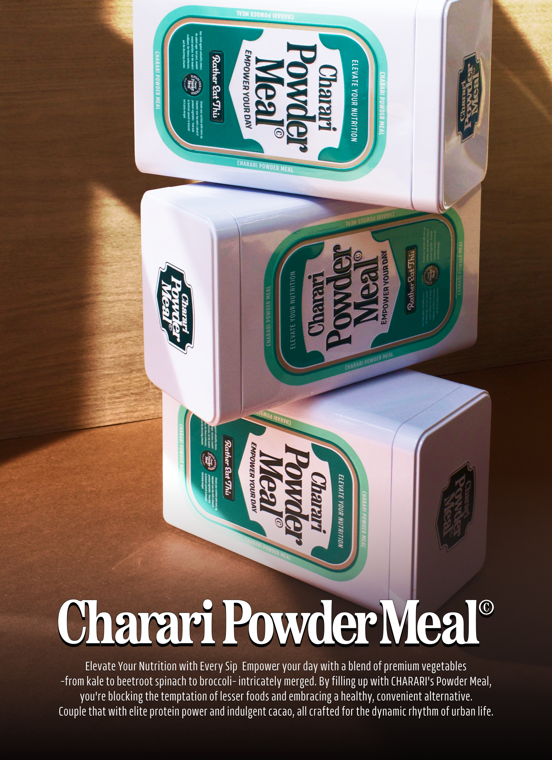
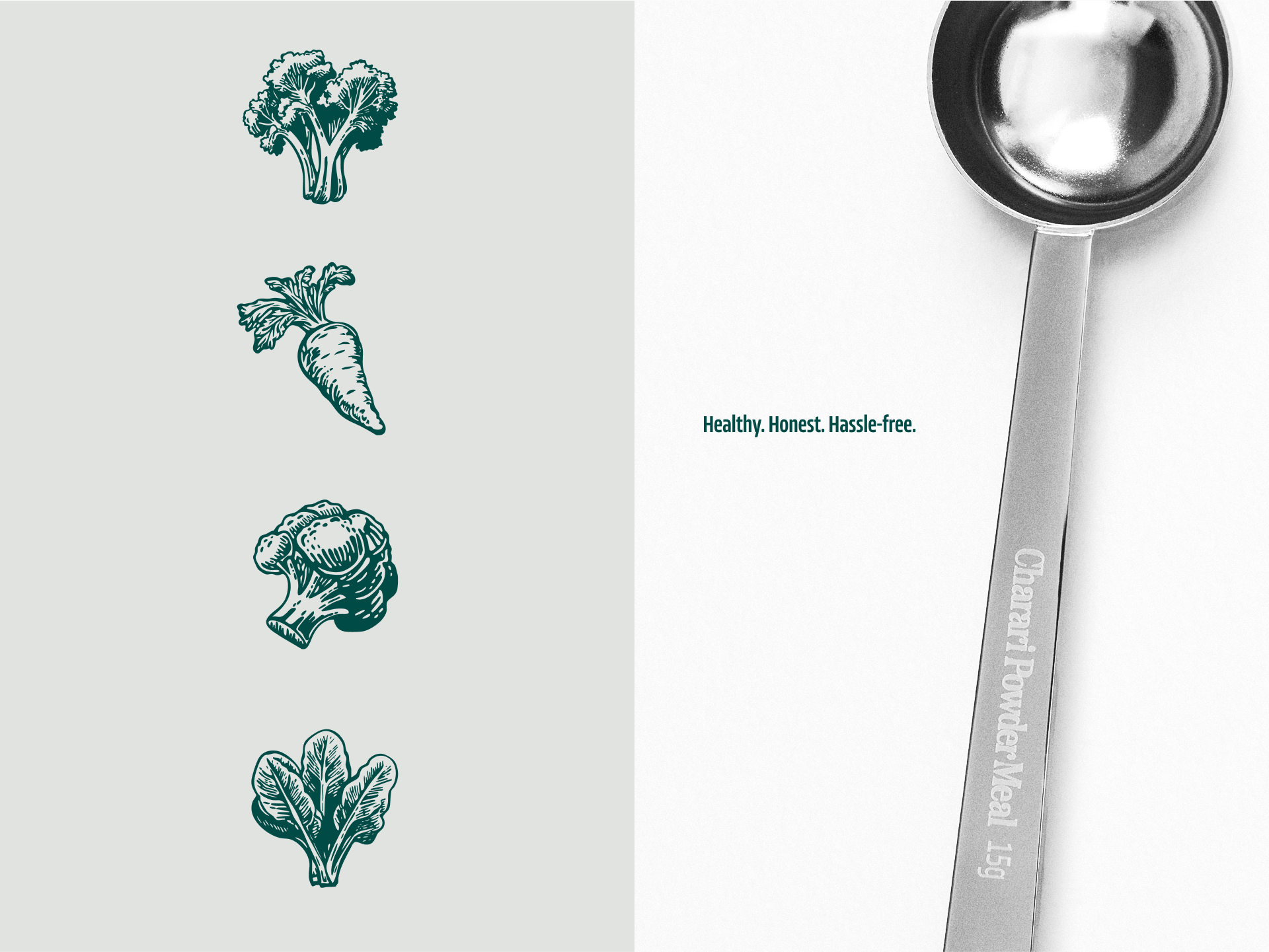
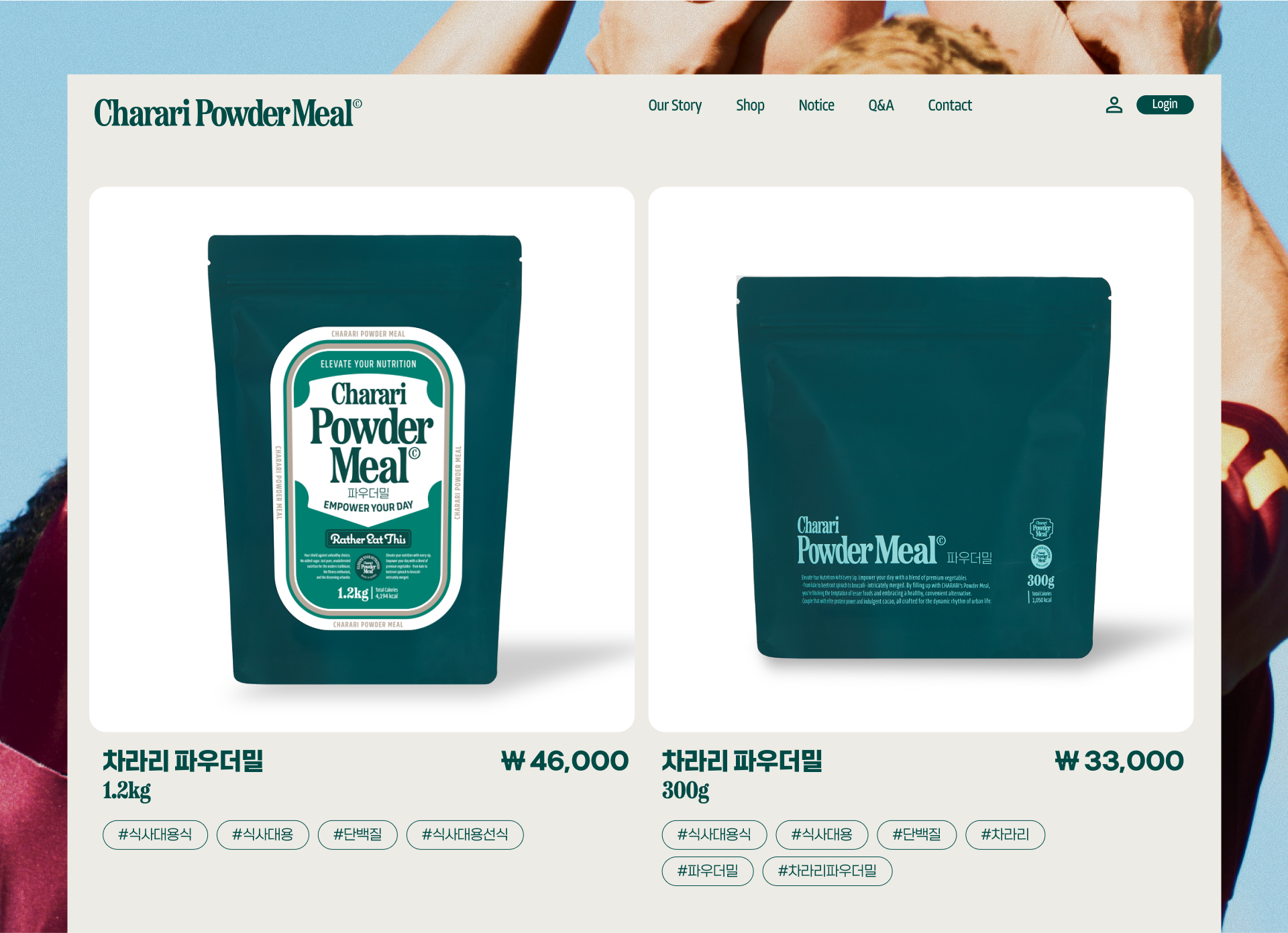
차라리 파우더밀은 프리미엄 식사대용식 파우더밀입니다. 엄선된 원료와 정제된 배합으로 설계된 간편한 파우더 타입의 식사로서 불필요한 첨가물은 덜고, 필수 영양은 더해 몸에 부담 없이, 맛있게 즐길 수 있는 프리미엄 퀄리티를 추구합니다.
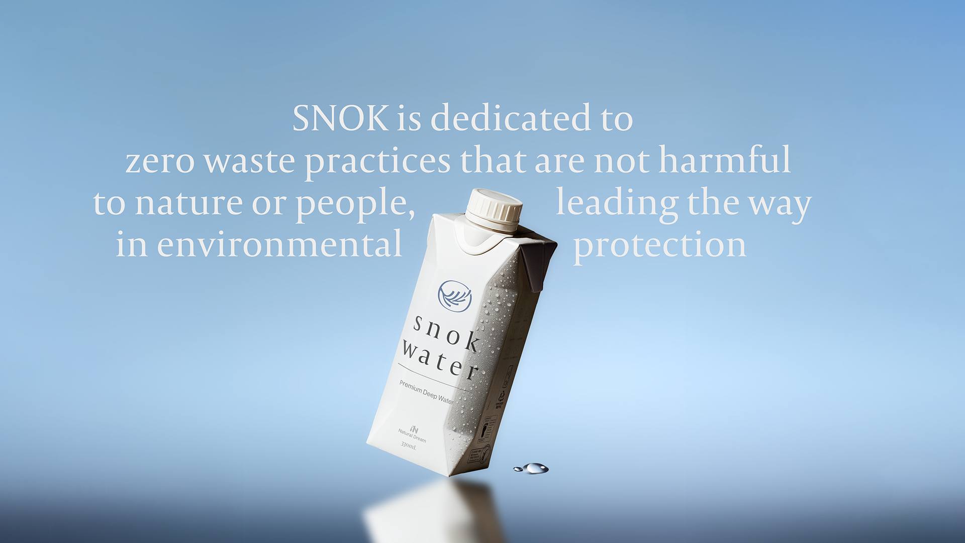
케이스 크리에이티브는 차라리 파우더밀의 브랜드 아이덴티티와 패키지 디자인을 담당했습니다. 기존 디자인은 다소 남성적이고 단백질 보충제 같은 인상이 강했기 때문에, 식사 대용식임을 명확히 하고, 남녀 모두를 타깃으로 하는 방향 전환이 필요했습니다. 그러나 ‘중성적이고 건강한 느낌’의 디자인은 이미 시장에 많았기에, 해당 방향성을 유지하면서도 차별화된 비주얼 전략을 고민했습니다. 우리는 과거 미국의 시리얼 패키지와 영양제 패키지 디자인에서 영감을 받아 식사대용식 제품을 보다 일상적이고 감각적인 오브제로 느낄 수 있도록 디자인했습니다. 특히 제품이 테이블 위에 놓였을 때, 인테리어 소품처럼 보일 수 있는 비주얼을 의도했습니다. 또한 차라리는 구독형 프리미엄 제품으로서, 첫 배송에서의 고객 경험과 집에서의 보관 편의성 모두를 고려해 웰컴 키트와 틴케이스의 퀄리티를 강화했습니다.
케이스 크리에이티브는 차라리 파우더밀의 브랜드 아이덴티티와 패키지 디자인을 담당했습니다. 기존 디자인은 다소 남성적이고 단백질 보충제 같은 인상이 강했기 때문에, 식사 대용식임을 명확히 하고, 남녀 모두를 타깃으로 하는 방향 전환이 필요했습니다. 그러나 ‘중성적이고 건강한 느낌’의 디자인은 이미 시장에 많았기에, 해당 방향성을 유지하면서도 차별화된 비주얼 전략을 고민했습니다. 우리는 과거 미국의 시리얼 패키지와 영양제 패키지 디자인에서 영감을 받아 식사대용식 제품을 보다 일상적이고 감각적인 오브제로 느낄 수 있도록 디자인했습니다. 특히 제품이 테이블 위에 놓였을 때, 인테리어 소품처럼 보일 수 있는 비주얼을 의도했습니다. 또한 차라리는 구독형 프리미엄 제품으로서, 첫 배송에서의 고객 경험과 집에서의 보관 편의성 모두를 고려해 웰컴 키트와 틴케이스의 퀄리티를 강화했습니다.
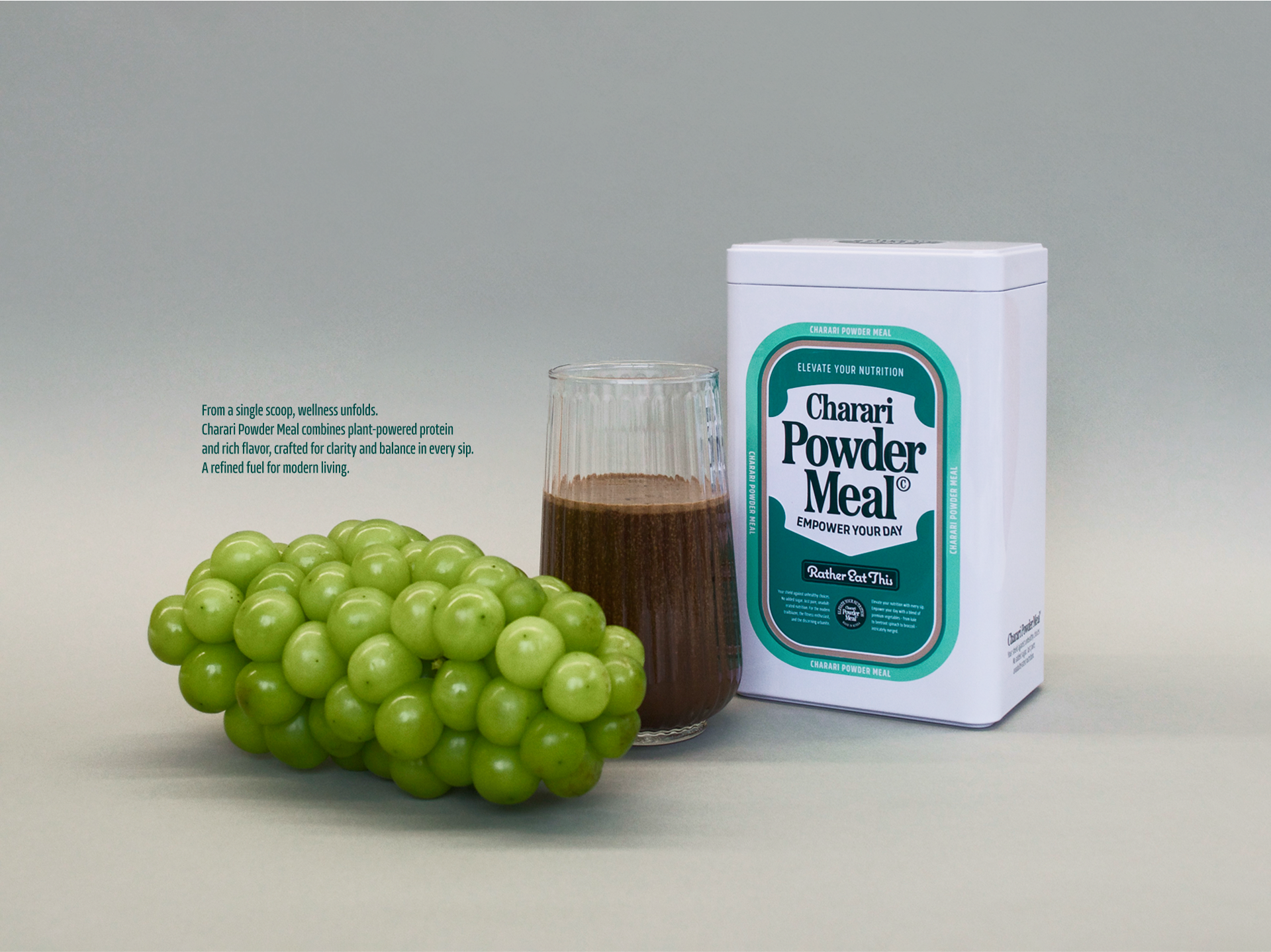
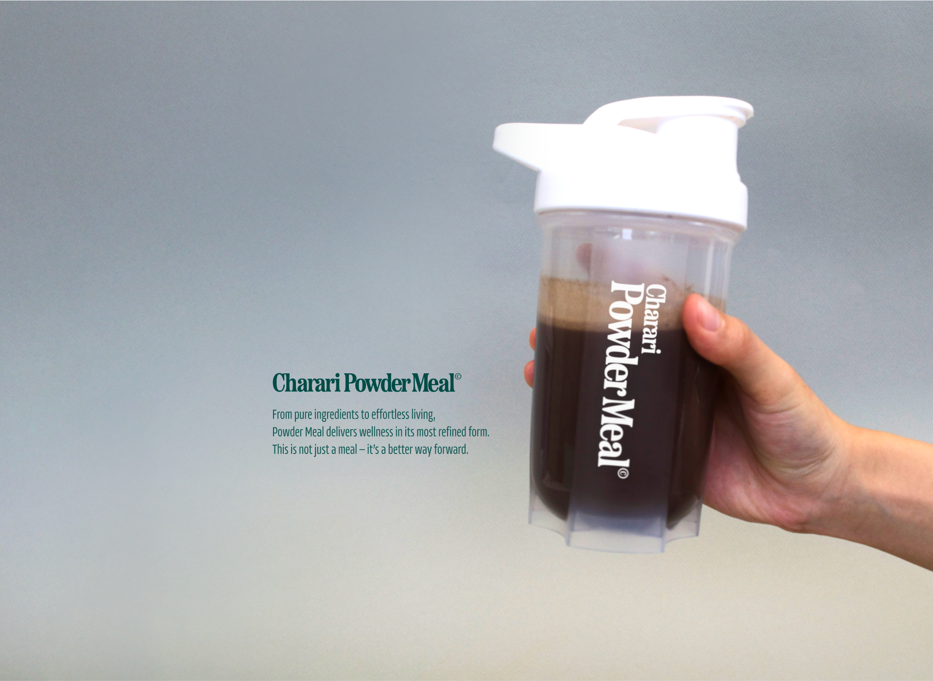
Charari Powder Meal is a premium powdered meal replacement. Formulated with carefully selected ingredients and a refined nutritional balance, it offers a convenient meal option in powder form—free from unnecessary additives, rich in essential nutrients, and easy on the body without compromising on taste.
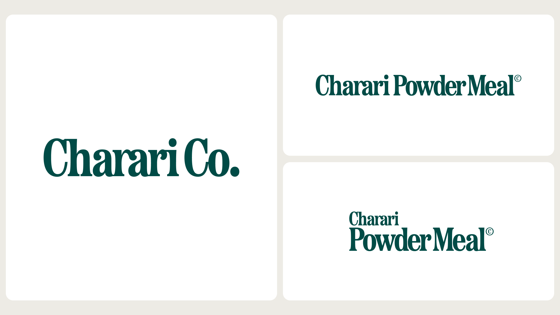
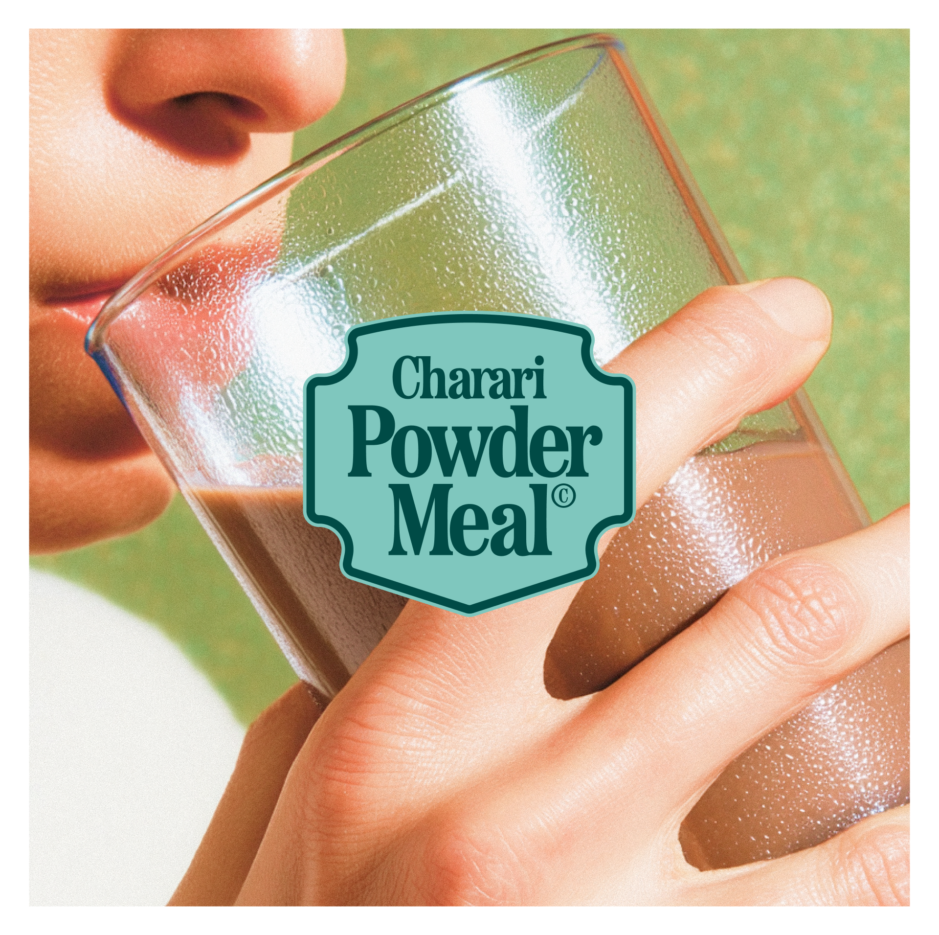
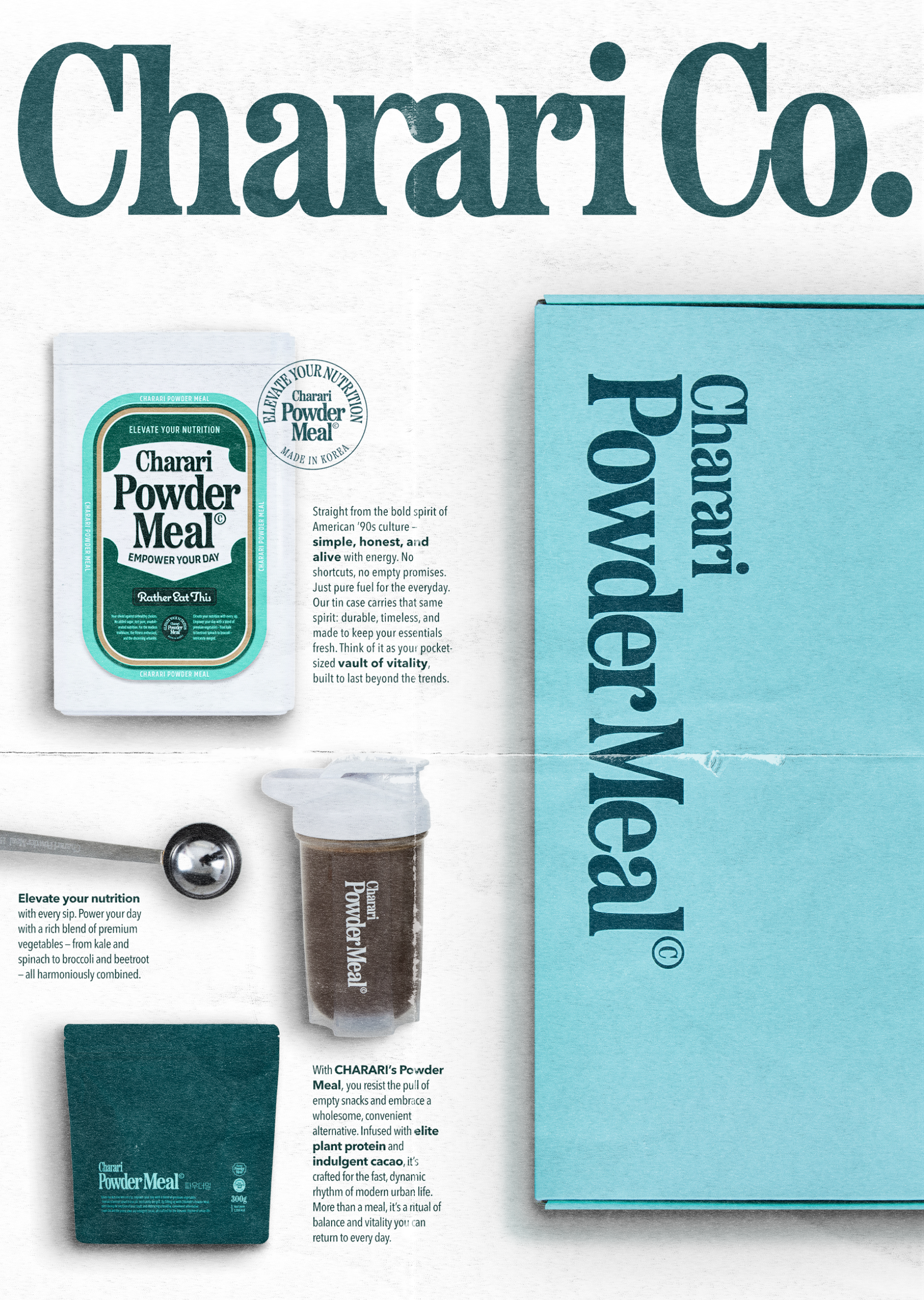
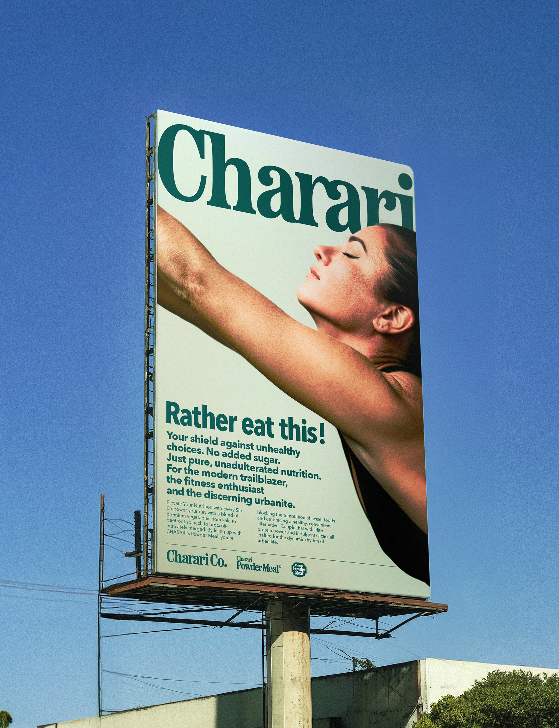
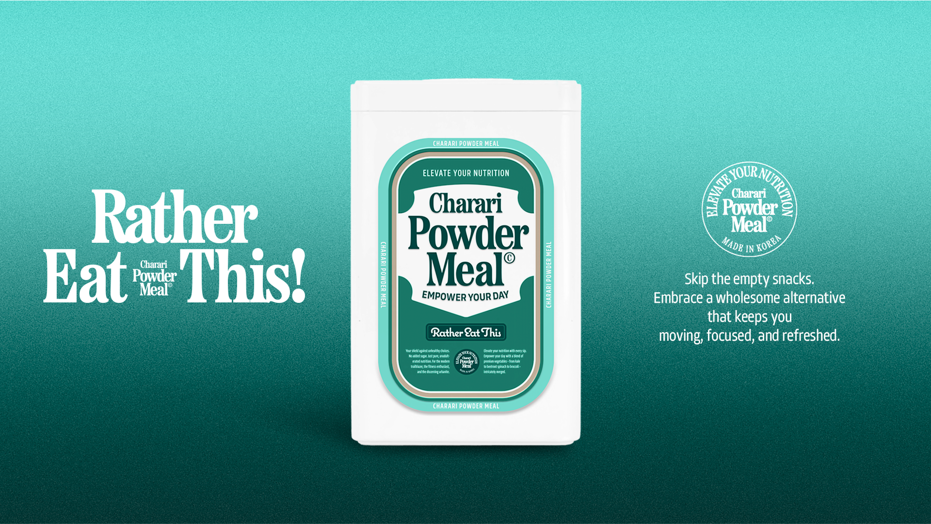
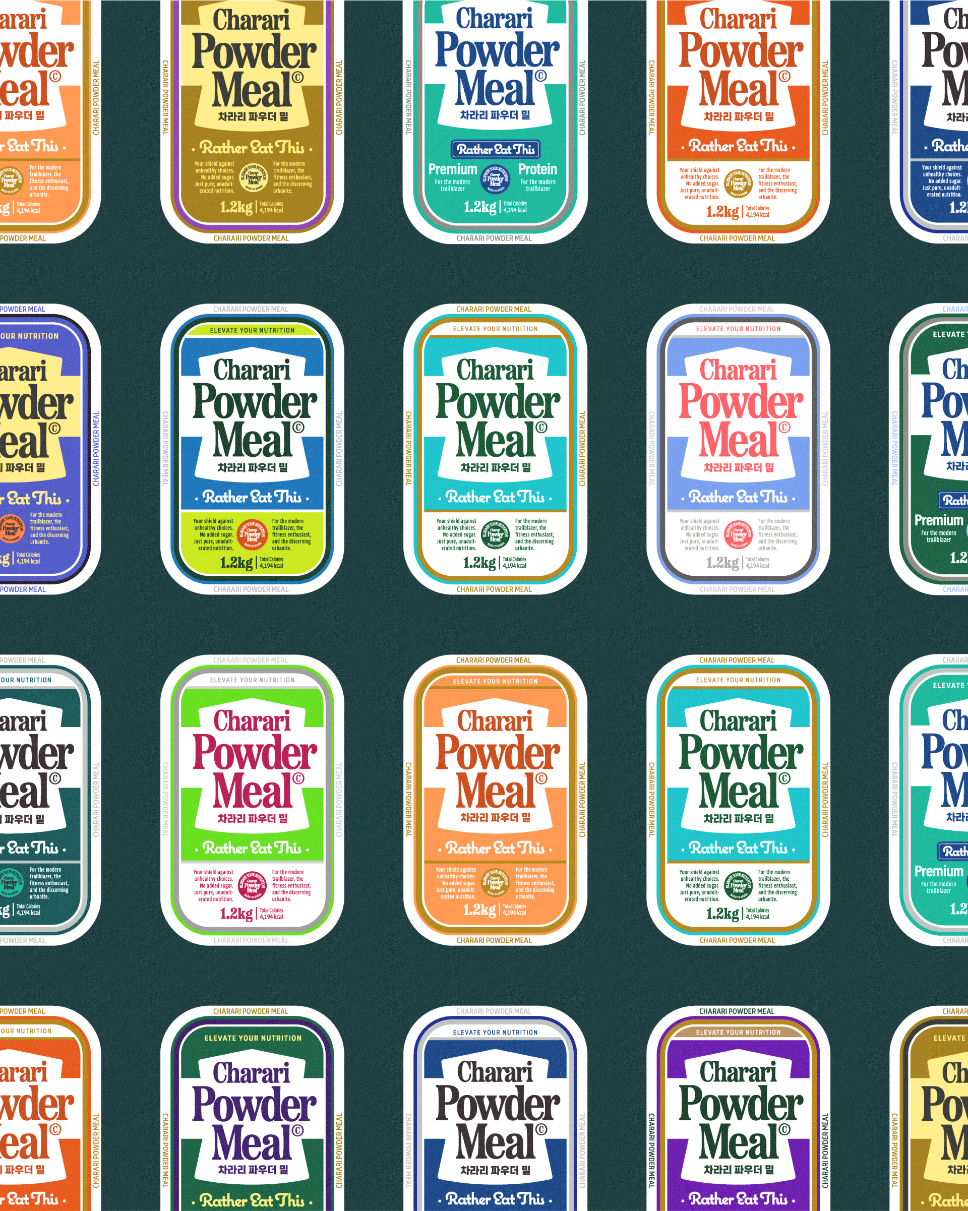
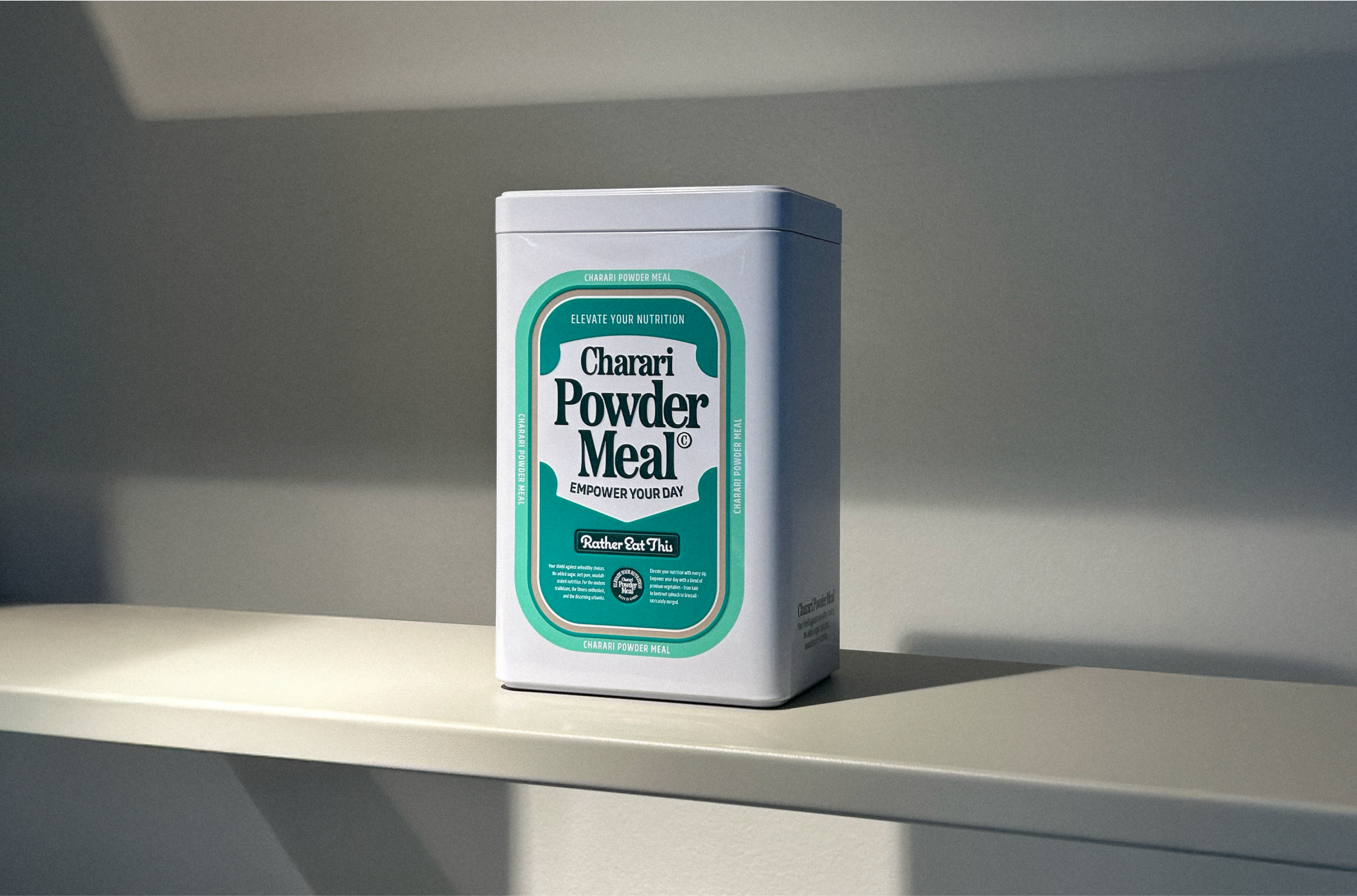
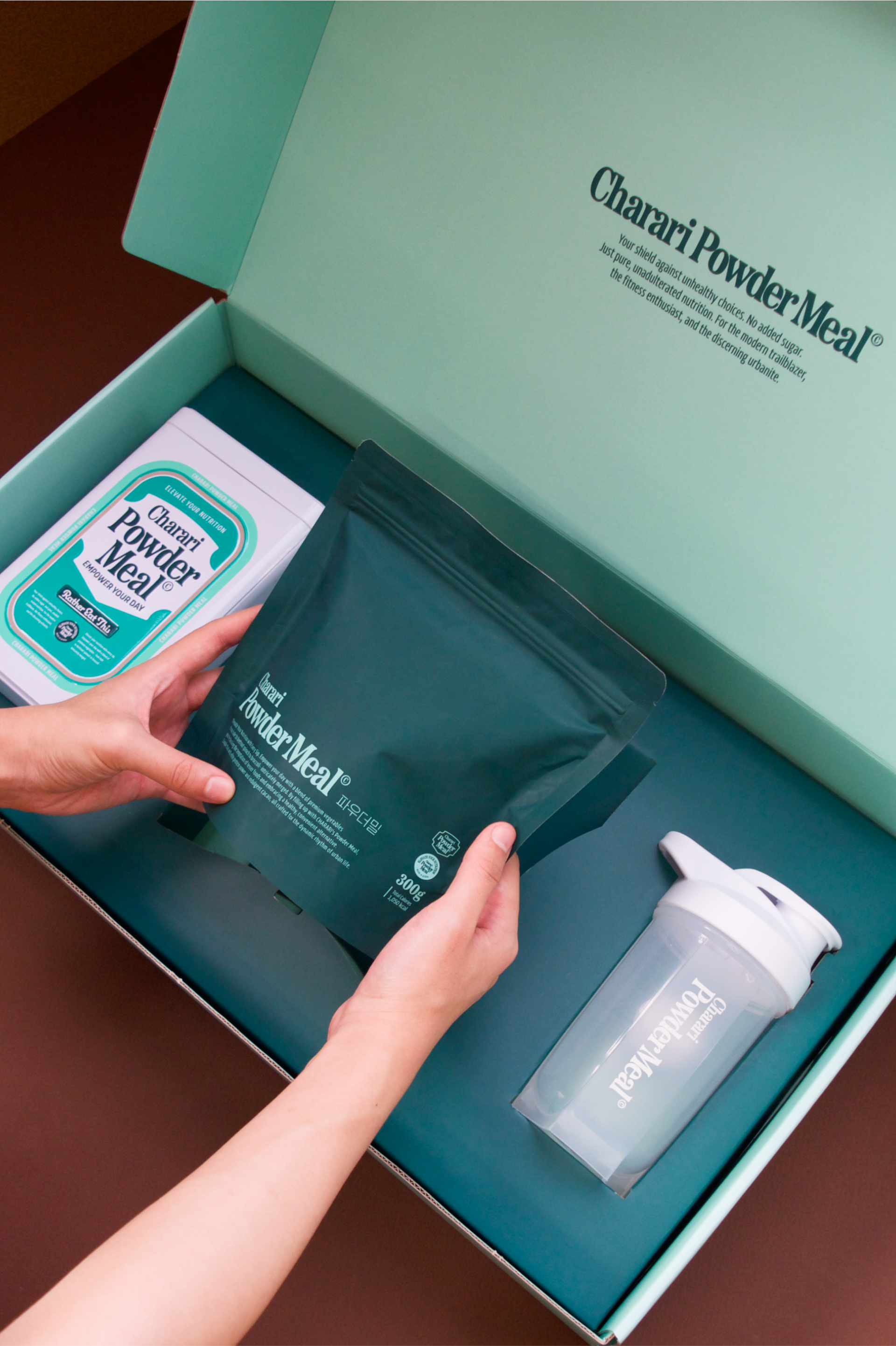
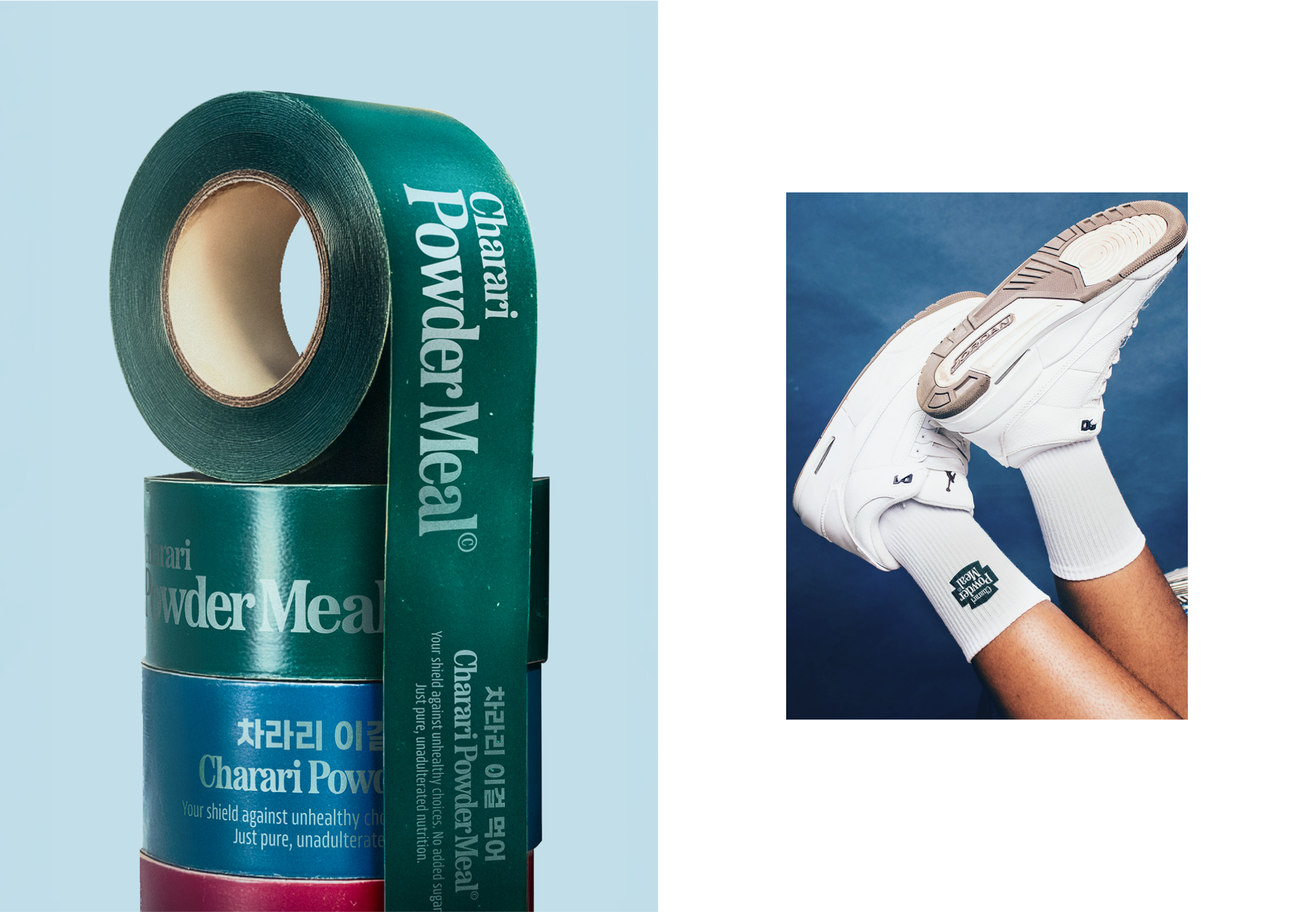
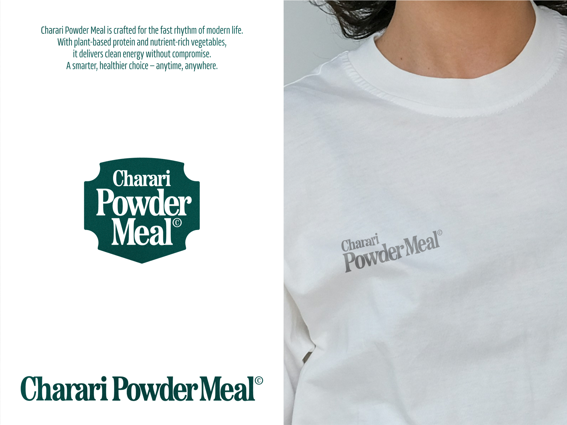
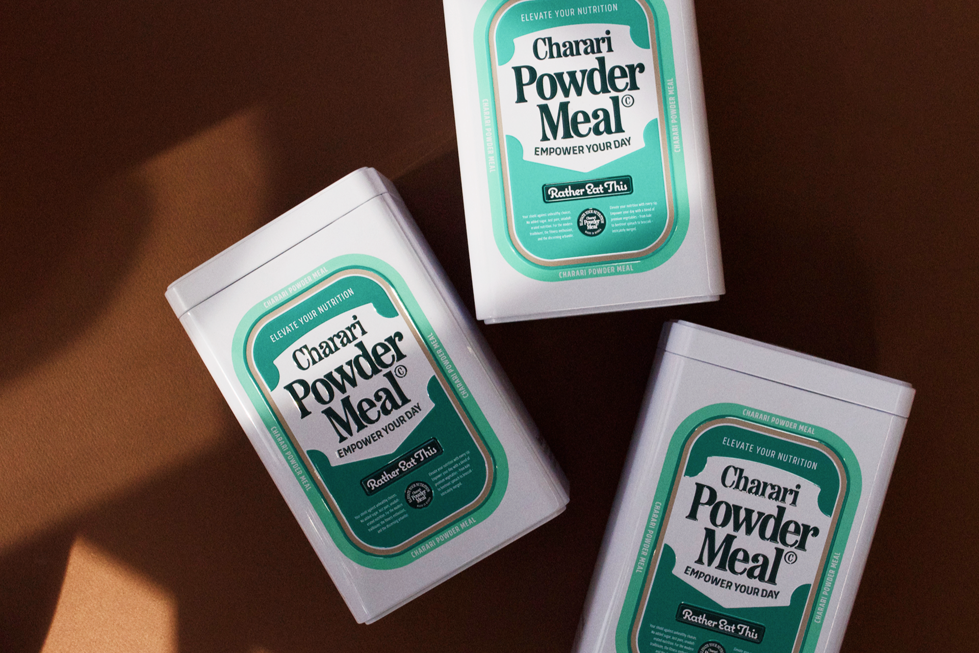
CASE Creative was in charge of the brand identity and packaging design for Charari Powder Meal. The previous design gave off a somewhat masculine and protein-supplement-like impression, which called for a clear repositioning toward a meal replacement product that targets both men and women. However, since the “neutral and healthy” visual direction is already common in the market, we aimed to maintain that tone while establishing a distinctive visual strategy. We drew inspiration from classic American cereal and supplement packaging, reimagining the product as an everyday, aesthetically pleasing object. Our goal was to create a design that would feel at home on a kitchen table—not just as a functional item, but as part of the interior. As a subscription-based premium product, Charari also required careful attention to the unboxing experience and long-term storage. We therefore elevated the quality of both the welcome kit and tin case, ensuring they deliver on both function and form in the user’s daily environment.
CASE Creative was in charge of the brand identity and packaging design for Charari Powder Meal. The previous design gave off a somewhat masculine and protein-supplement-like impression, which called for a clear repositioning toward a meal replacement product that targets both men and women. However, since the “neutral and healthy” visual direction is already common in the market, we aimed to maintain that tone while establishing a distinctive visual strategy. We drew inspiration from classic American cereal and supplement packaging, reimagining the product as an everyday, aesthetically pleasing object. Our goal was to create a design that would feel at home on a kitchen table—not just as a functional item, but as part of the interior. As a subscription-based premium product, Charari also required careful attention to the unboxing experience and long-term storage. We therefore elevated the quality of both the welcome kit and tin case, ensuring they deliver on both function and form in the user’s daily environment.
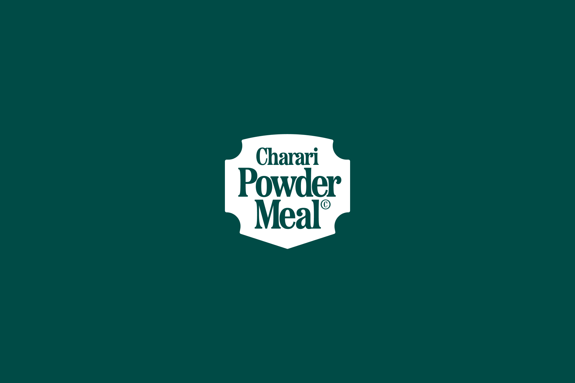
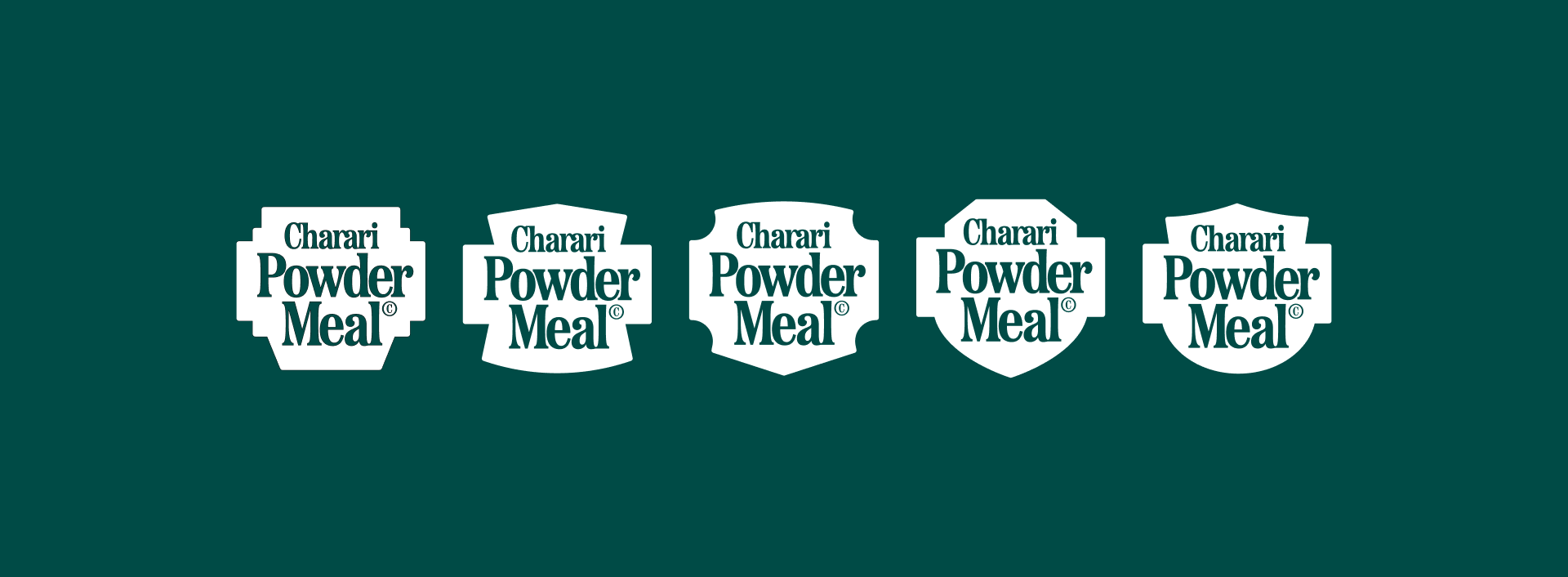
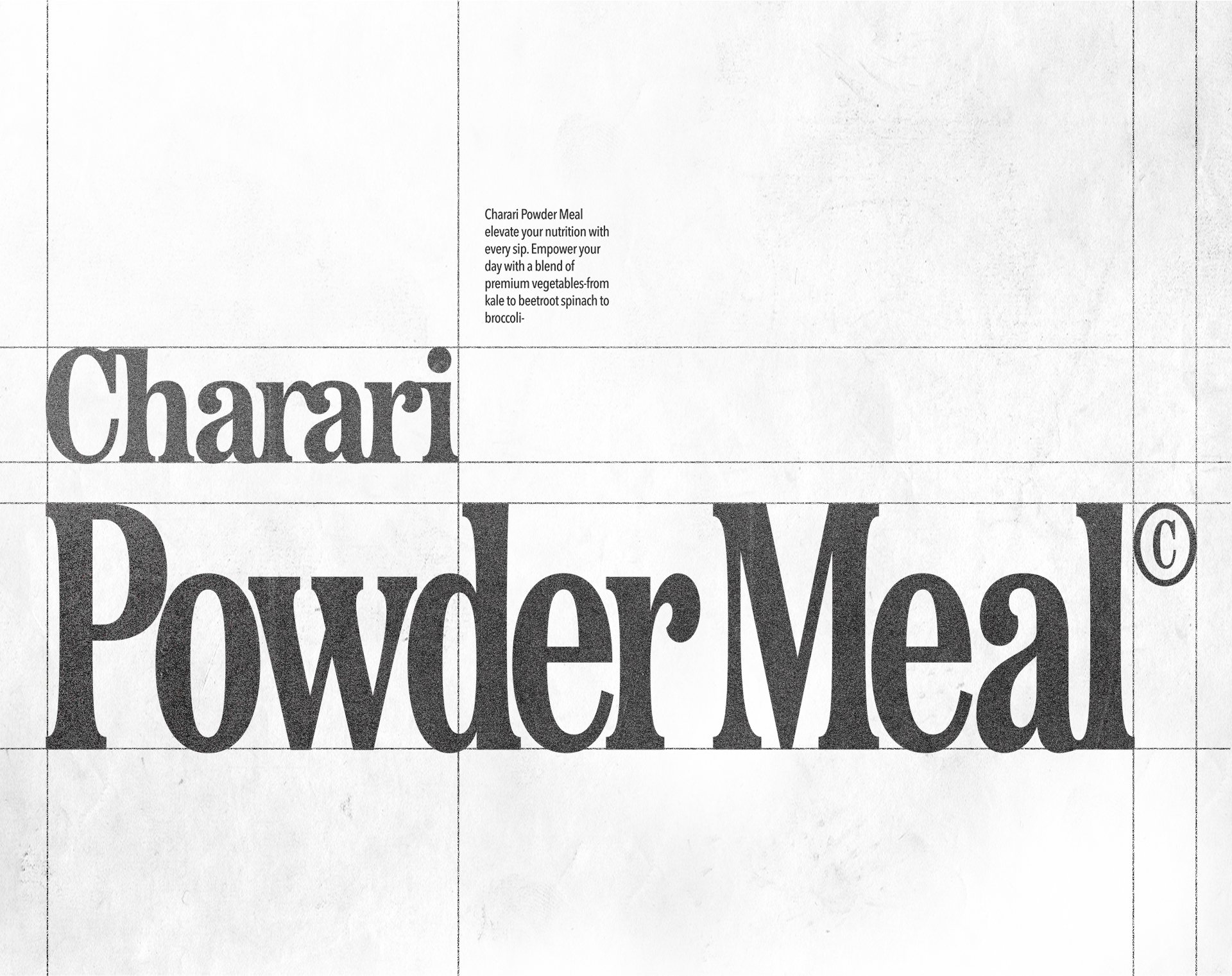
Charari Powder Meal BI & Package Design
Year: 2024
Client: Charari Inc.
Case-creative
Art Direction: Joo wonsik
Graphic Design: Lim eunji, Oh jaeheon
Design Assistant: Kim nayeon, Lee jiyeong
Year: 2024
Client: Charari Inc.
Case-creative
Art Direction: Joo wonsik
Graphic Design: Lim eunji, Oh jaeheon
Design Assistant: Kim nayeon, Lee jiyeong
Case-Creative Ⓒ All Rights Reserved